Why Edited PDF Text Looks Different: Fonts, Size and Spacing Explained
Learn why replacement text may not match a PDF and how font availability, size, spacing and text length affect the final layout.
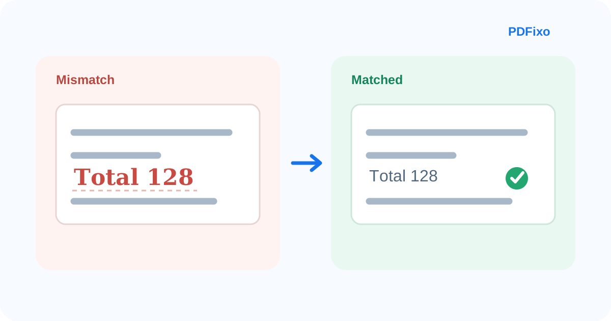
You changed the correct word, but the result still looks wrong.
Maybe the replacement is slightly wider. Maybe the weight looks heavier. Maybe the baseline is off by a few pixels, or the new text fits the line but clearly does not match the surrounding paragraph.
That does not necessarily mean the edit failed. In a PDF, matching the characters is only one part of matching the appearance.
The most common causes are:
- the original font is unavailable or cannot be reproduced exactly;
- the font size, weight or colour is different;
- character spacing or alignment does not match;
- the replacement text is longer or shorter than the original;
- the visible text came from OCR or a scan rather than ordinary digital text.
The useful approach is to identify which of those problems you actually have before changing several settings at once.
Why PDF text does not behave exactly like Word text
A Word document is designed to reflow.
If you change a word, the surrounding paragraph can move, wrap and repaginate automatically.
A PDF is usually the opposite: it is designed to preserve a fixed page appearance. Text, images and other objects are positioned on a page, often with much tighter geometry.
That is why a one-word replacement can expose differences that would be invisible in a normal word processor.
The new word may be correct, but if it uses a different font metric or takes more horizontal space, the line can look visibly changed.
Problem 1: The original font is not available
Font availability is one of the biggest reasons replacement text looks different.
A PDF may use:
- a fully embedded font;
- a partially embedded subset;
- a font installed on the system that created the PDF;
- a font that is no longer available to the editor;
- a fallback or substituted font.
Adobe's current documentation notes that unavailable fonts can trigger substitution behavior. That means an editor may need to use a close match rather than the exact original typeface.
Two fonts can look similar while still having different character widths, stroke shapes and spacing.
For example, the word:
Total
may occupy slightly more or less space in another font even when the point size is identical.
What to check
Start with the font family.
If the exact font is available, use it.
If it is not, choose the closest visual match and then check size, weight and spacing rather than assuming the font name alone will solve the problem.
PDFixo exposes manual font-family controls for existing editable text, but it should not be assumed that every embedded source font can always be reproduced exactly.
Problem 2: The font size is technically close but visually wrong
Point size is another common trap.
A 12 pt replacement in one font does not necessarily look the same as 12 pt text in another font.
Fonts have different:
- x-heights;
- cap heights;
- ascenders and descenders;
- stroke weights;
- internal spacing;
- character widths.
So the correct correction is not always “use the same point size.”
The practical goal is visual consistency with the surrounding text.
What to check
Compare:
- height of lowercase letters;
- height of capital letters;
- thickness of strokes;
- baseline position;
- spacing above and below the line.
If the replacement looks too tall or too small, make a small adjustment and recheck the whole line.
Avoid shrinking text dramatically just to force a long replacement into a narrow space.
Problem 3: Weight, colour or background is different
Sometimes the font and size are close, but the replacement still stands out.
That may be because the surrounding text is:
- bold or semibold;
- a slightly different grey or colour;
- sitting on a coloured background;
- antialiased differently;
- visually affected by the scan or image behind it.
PDFixo provides controls for colour, background, bold, italic and underline in the existing-text editing workflow.
Match the obvious styling first, but remember that a digitally recreated word may still look cleaner than neighbouring scanned text.
That difference is especially noticeable on older scans.
Problem 4: Character spacing or alignment is off
You can choose a similar font and size and still get a mismatch because the spaces between characters are different.
This is why the replacement may look:
- too loose;
- too compressed;
- shifted left or right;
- visually off-centre inside a form field;
- misaligned with nearby numbers.
Adobe exposes character spacing, line spacing, alignment and other formatting controls in its PDF-editing tools because text appearance involves more than font family and font size.
The exact controls available depend on the editor and PDF structure.
What to check
Look at the entire text run, not one letter.
Compare:
- left edge;
- right edge;
- baseline;
- distance to the next word;
- alignment with nearby labels or values.
A small horizontal difference can be more visible than a small font-size difference.
Problem 5: The replacement text is longer than the original
This is often the real issue.
Replacing:
2025 with 2026
uses almost the same amount of space.
Replacing:
Q3 with Third Quarter Review
does not.
A PDF text region may have limited room. If the replacement becomes longer, the editor has to fit more characters into geometry that was designed for the original content.
That can lead to:
- overlap with nearby content;
- tighter spacing;
- text extending beyond the original region;
- a smaller font;
- the need to reposition the text block.
If the new content is much longer, direct PDF editing may no longer be the best workflow.
For a small correction, see how to fix a typo, date or number directly in a PDF.
For a larger rewrite, converting to Word may give you more flexible reflow.
Problem 6: The text came from OCR
Scanned pages create a different situation.
If the visible page is an image, OCR first has to recognize the characters and create editable text regions.
The recognized text can be correct while the visual match remains imperfect because:
- the original letters are still part of the scanned image;
- OCR is identifying content, not recovering the original font file;
- a scanned page may contain distortion, blur or uneven printing;
- word boxes may not line up exactly with the source image.
That is why editing OCR-derived text is partly a recognition problem and partly a visual-matching problem.
If you are not sure whether the page is digital or scanned, read why PDF text may not be selectable.
A practical PDFixo correction order
If replacement text looks wrong in PDFixo, change one category at a time.
1. Check the font family
Use the same font if it is available.
If not, choose the closest visual alternative.
2. Check size
Compare the replacement with nearby letters rather than relying only on the numeric point size.
3. Check weight and colour
Match bold/italic styling and colour/background where necessary.
4. Check the amount of text
If the replacement is much longer, decide whether the problem is really formatting—or simply lack of space.
5. Check position and the whole line
A visually correct word can still look wrong if it is slightly misaligned.
6. Zoom out
After making the local correction, inspect the full page.
The edit should look natural at normal reading size, not only when zoomed in.
When a close match is acceptable
Not every PDF requires forensic visual matching.
For internal drafts, notes, simple forms or temporary documents, a close visual match may be sufficient.
For a polished brochure, customer-facing file, archived document or high-value publication, the standard is higher.
If the original appearance must be exact and you still have access to the source Word, InDesign, PowerPoint or other authoring file, editing the source and exporting a new PDF is often more reliable than reconstructing the typography inside the PDF.
When to stop editing the PDF directly
Consider another workflow when:
- the exact source font is unavailable and the mismatch is unacceptable;
- the replacement is much longer than the original;
- several paragraphs need rewriting;
- complex tables or multi-column layouts begin shifting;
- the page is a poor scan;
- the document must exactly reproduce the original authoring structure.
In those cases, PDFixo PDF to Word may be useful when editability matters more than preserving every original page coordinate.
Remember that Word conversion itself can introduce layout changes, so the result still needs review.
A simple visual checklist
Before downloading, compare the replacement with the surrounding text for:
- font family;
- apparent size;
- weight;
- colour;
- spacing;
- baseline;
- left/right alignment;
- available space;
- page-level balance.
Do not keep adjusting settings indefinitely if the real problem is that the replacement is structurally too large for the original space.
The shortest useful rule
If edited PDF text looks different, check in this order:
Font → size → weight/colour → spacing → text length → position.
If the page is scanned, treat OCR recognition and visual matching as separate problems.
Next step
Open PDFixo Edit PDF, compare the replacement with the surrounding line, and adjust the smallest number of formatting variables necessary.
If the change is too large for the original text region, consider a more flexible workflow such as PDFixo PDF to Word instead of forcing the text to fit.
Found an unclear step or an outdated detail? Tell our support team.